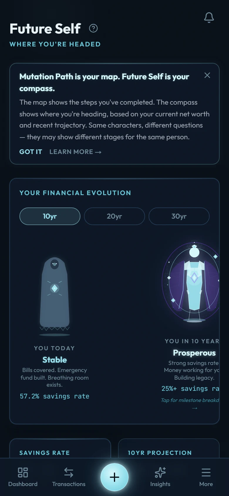
The Future Self projection extends your actual behavior forward: your real income, spending, and saving pattern from your recent complete months, compounded over 10, 20, and 30 years. It's not a hypothetical calculator; it's your current trajectory, made visible.
When it turns on
Future Self needs at least three complete months of tracking before it activates. A month only counts once it has finished. The month you're currently in doesn't count until it ends. So the transactions you record today build toward it, but the counter moves at each month-end, not with each entry. Until you reach three, you'll see a locked screen showing your progress (for example, "2 of 3 months tracked").
The lines and the band
- Current pace: where your net worth goes if the recent months keep repeating. This solid line is the honest centre; it moves when your behaviour moves.
- If markets are kind, and if the decade is rough: a dashed line above and below, with a shaded band between them. All three lines assume you keep saving at your typical monthly pace (your median month, so one big purchase or windfall doesn't distort it). What differs is the investment return: the expected line uses your assumed rate, the upper line a couple of points better, the lower a couple of points worse. Markets are the honest unknown over decades — your saving pace is the part you control. A line that crosses below zero means that pace would eventually put you in debt.
- Milestone markers: with "Show milestones" on, a vertical dashed line stands at the year each of your next milestones is projected to land. The chart shows your three nearest upcoming milestones; the full list with dates lives in the timeline below it.
Why it changes
The projection recalculates from your data, so a strong saving month bends it upward and a heavy quarter flattens it. Don't read a single month's wobble as destiny. The point is the trend, and the trend responds to you. That responsiveness is deliberate: watching the curve move after a real decision is the most motivating feedback loop in personal finance.
The scenario explorer
The What If panel prices decisions in three ways, and every one of them works in both directions — spending less and earning more:
- Quick: one-tap amounts. Save 500 more a month, or earn 2,000 more; a custom amount can be entered as saving or as income. Earning scenarios count the extra as saved.
- Categories: your own categories, biggest first. Pick one and try a 10, 25, or 50 percent change. A dining cut or a freelance raise both redraw the projection. The list is simply your spending (or income) sorted by your own averages; nothing is hidden or pre-judged.
- Planned purchase: enter a price (or an EMI) and see three futures on one scale: skip it and invest, your current pace, or buy it. Real amounts at your selected horizon, with your milestone dates shifted each way. Neither fork is "right"; the tool prices them, you choose.
Each scenario also shows what it means in hours of your life at your own earning rate: a cut buys hours back every month, a raise makes every hour pay more. You can stack up to three scenarios at once.
Your runway
Below the summary cards, the runway answers one blunt question: if income stopped today, how long could you live at your current spending? The headline counts the money you could live on: your cash, bank, savings and investment balances. Retirement accounts and your house stay out of it. The second row counts everything you own, minus what you owe. The cut chips re-answer it instantly at lower spending, and any active What If scenario reports how it changes the pace this number grows at.
Reading it with the right expectations
Projections assume the future resembles the recent past. No forecast survives a career change, a market crash, or a windfall. That's fine: the projection's job is to make this month's behavior visible at the scale where it matters.