Reports are the long view, the place where months of small entries turn into shapes you can actually see. They live under Insights → Reports, and everything they show is computed from your own monthly summaries.
Snapshot
One period, broken open. Pick a range at the top of the page and Snapshot shows what came in, what went out, and which categories the spending sat in. This is the view for "where did last month actually go", and a category is one tap from its own detail.
Trends
The same entries as time series: cash flow month by month, a cumulative net worth line, and your savings rate.
Net worth
Your total (assets minus debts), traced month by month.
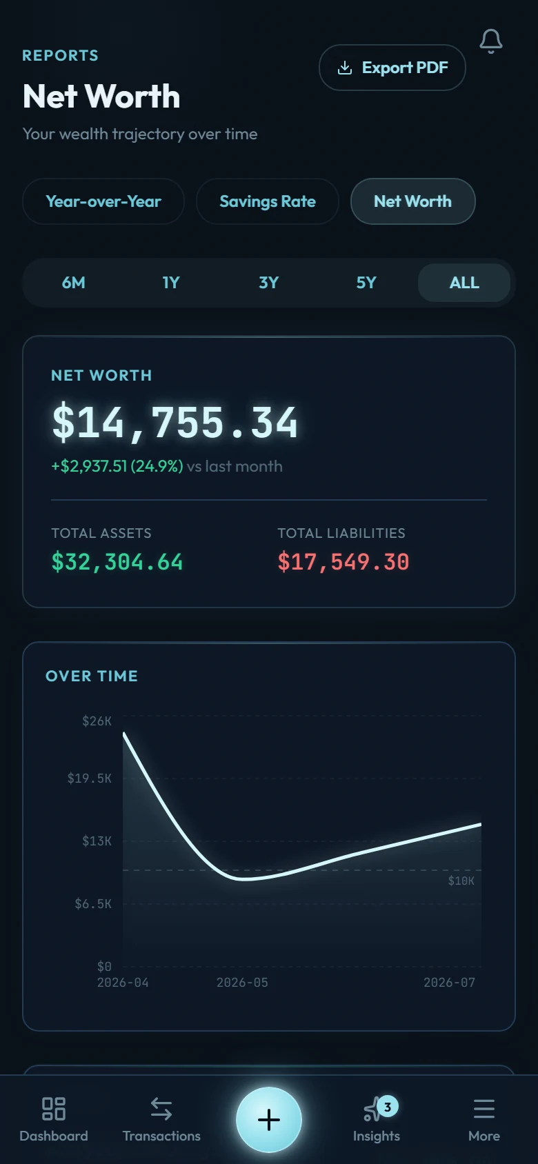
This is the slowest, truest chart in the app. Daily spending wobbles; net worth trends. If the line points up across quarters, the system is working, whatever any single week felt like.
Savings rate
Each month's rate (what percentage of income you kept), drawn as a line with a point for every month. It's the single strongest lever in your Future Self projections, and the fastest-moving number in Reports: one changed habit shows up in next month's point.
The Mutation Path's Accelerate and Compound levels measure a wider number: wealth velocity, meaning your net-worth growth over the trailing year as a share of your annual income (15% for Accelerate, 25% for Compound). Each level also has a capital route, a net worth at 10 and 15 times your average annual spending, for anyone already past the point where a growth percentage says much. Investment growth you record and debt paydown count toward velocity alongside what you saved, so the two charts can move in different directions in the same month. Money you keep still lands in your net worth, which makes savings rate the part of wealth velocity you steer most directly.
Multi-year
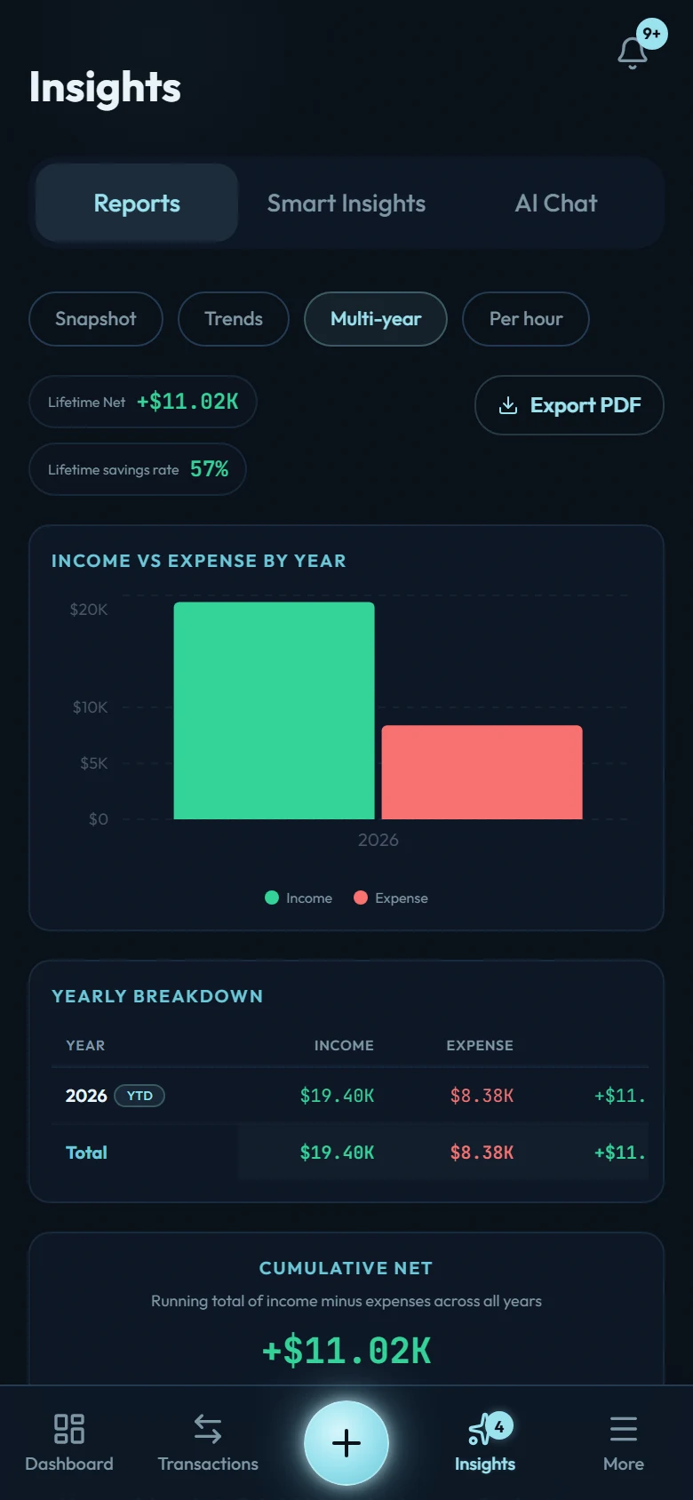
Whole years side by side: what came in, what went out, what you kept, and the savings rate for each year you have, plus any earlier years you add by hand from the link at the bottom of the view. The PDF export lives here too. Spending has seasons (festivals, school terms, renewals); a row per year separates "we always spend more in December" from "something changed."
Per hour
Your spending priced in the hours behind it, over a trailing 12 months. The window is fixed, so this view carries no range picker of its own. It arrives once you have three complete months on record: Money per hour explains what the figure is doing and where else in the app it turns up.